color science, transfer functions, and human perception
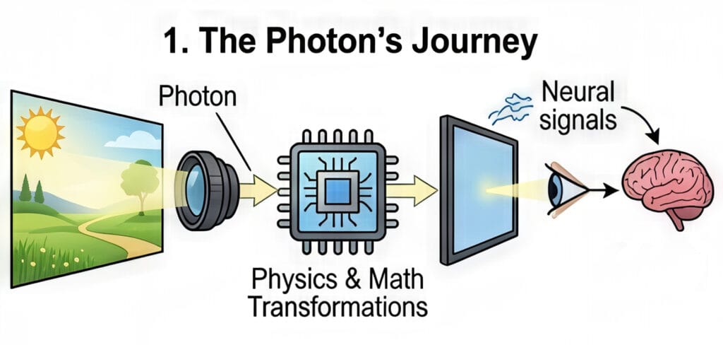
The journey of a photon from a real-world scene to a human retina through a digital medium is one of the most complex transformations in modern technology. This process involves a sophisticated interplay of physics, mathematics, and biology, ensuring that the light emitted by a screen evokes a response in the viewer that is subjectively similar to the original experience. To understand this “imaging chain,” one must navigate the intricacies of color spaces, gamuts, transfer functions, and the peculiar ways the human brain interprets light and shadow.
The cartography of color: Spaces and gamuts

In the digital domain, color is not merely a visual sensation; it is a coordinate in a mathematical model. Two terms often used interchangeably—color space and color gamut—actually represent two different layers of the imaging process. Understanding the distinction is fundamental to both casual content consumption and professional media production.
Defining the color space: The mathematical container
A color space is a standardized mathematical model that defines how colors are represented as sets of numbers. It serves as a 3D coordinate system where every possible hue, saturation, and brightness level is assigned a specific address, often expressed as R, G, B values. For example, the color red might be represented as (255, 0, 0) in an 8-bit system, but the “flavor” of that red depends entirely on the color space being used.
One of the most intuitive analogies for a color space is a box of crayons. A standard box gives you a finite number of colors to draw with; the larger the box, the more subtle shades and vibrant hues you can access. Common color spaces used in photography and video include sRGB, Adobe RGB, and ProPhoto RGB.
| Color Space Standard | Primary Application | Characteristics |
| sRGB | Web, basic monitors, standard printers | The “lowest common denominator” for internet content. |
| Adobe RGB | Professional photography and high-end printing | Offers a wider range of greens and cyans than sRGB. |
| DCI-P3 | Digital cinema and modern HDR displays | A wider gamut used for cinematic experiences and modern smartphones. |
| Rec. 2020 | Ultra High Definition (UHD) TV | An extremely wide space designed for 4K and 8K delivery. |
| ProPhoto RGB | High-end photo editing | A massive space that can represent almost all colors visible to the human eye. |
The mathematical foundation for these spaces is the CIE 1931 chromaticity diagram, which maps the average spectral sensitivity of the human eye. This diagram looks like a colorful horseshoe, representing every color a human can perceive. Individual color spaces are typically represented as triangles within this horseshoe; the larger the triangle, the more of the human-perceivable spectrum the space covers.
Understanding the color gamut: The device’s reach
While a color space is a theoretical definition of what is possible, a color gamut represents the practical capabilities of a specific device, such as a monitor, camera sensor, or printer. It is the entire range of colors that a piece of hardware can actually reproduce, display, or capture.
Continuing the crayon analogy, if the color space is the “box of crayons,” the gamut is the “artist’s ability” to actually use them on a specific type of paper. A monitor might claim to cover 100% of the sRGB color space but only 90% of the P3 space. This means that if you try to display a deep, saturated green that exists in the P3 space on an sRGB-limited monitor, the monitor will struggle to show the true intensity of that color.
High-end gaming monitors and HDR televisions are prized for their “wide gamut” capabilities. A wider gamut allows for more vibrant and lifelike visuals, as the device can reproduce shades that were previously impossible to display. However, if the content was not created for a wide gamut, displaying it on a wide-gamut screen can sometimes lead to oversaturation or inaccurate colors unless the system uses proper color management.

The mechanics of light: Gamma and transfer functions
One of the most counter-intuitive aspects of digital imaging is that light is not handled linearly. If you double the number of photons in a room, a camera sensor will record twice as much energy, but your eyes will not perceive the room as being twice as bright. This discrepancy necessitates the use of “gamma” and “transfer functions” to translate the cold, linear math of physics into the warm, logarithmic perception of biology.
The logarithmic eye vs. the linear sensor

Digital camera sensors are linear devices; their output doubles when the number of photons hitting the sensor doubles. Human vision, however, is significantly more sensitive to changes in dark areas than in bright ones. We perceive light more logarithmically, which allows us to see detail in deep shadows while also being able to navigate in bright sunlight.
If we were to store digital images in a linear format, we would waste a huge amount of data on the highlights—where our eyes are less sensitive—and not have enough data for the shadows—where our eyes are incredibly discerning. To solve this, we use transfer functions to “encode” the light into a non-linear signal that prioritizes the data where humans need it most.
Gamma: The ghost of the CRT era
The term “gamma” is a legacy of the early days of broadcast television. Cathode Ray Tube (CRT) monitors had a physical property where the intensity of the light produced by the electron gun was not linear relative to the voltage applied to it.
Interestingly, the physical “gamma” of a CRT monitor (typically around 2.2 to 2.4) was almost exactly the inverse of the human eye’s sensitivity. This meant that by luck of physics, the CRT naturally corrected the signal for human viewing. Although modern LCD and OLED screens do not have electron guns, we still simulate this “gamma curve” to ensure that digital images look natural.
OETF and EOTF: The digital handshake
In modern digital imaging, we replace the vague term “gamma” with two precise technical functions that act as the beginning and end of the imaging chain:
- Opto-Electronic Transfer Function (OETF): This is the process inside the camera. it converts the linear light from the scene into a non-linear electrical signal (like a Log or Gamma curve) for storage and transmission. This is often called “Camera Gamma”.
- Electro-Optical Transfer Function (EOTF): This is the process inside the display. It takes the non-linear electrical signal and converts it back into linear light that the viewer sees. This is often called “Display Gamma”.
By combining these two, we can ensure that the light hitting the viewer’s eye is correct. If the camera uses an OETF of 0.45 and the display uses an EOTF of 2.2, the resulting image will appear to have a linear relationship of 1.0(0.45 times 2.2 approx 1.0), which preserves the original scene’s brightness.
The bridge of perception: OOTF and system gamma
While the OETF and EOTF handle the hardware, a third function, the Opto-Optical Transfer Function (OOTF), handles the “look” of the image. The OOTF is essentially the “system gamma”—the total transformation of light from the original scene to the displayed image.
Why system gamma is not 1.0
It might seem logical that the goal of a television system is to reproduce the exact brightness of the original scene. However, this is rarely the case. Most people perceive a system gamma between 1.1 and 1.5 as more “natural” than a perfectly linear 1.0. This is because the environment in which we watch screens is usually much darker than the scene being captured.
A system gamma of 1.2 is common for standard high-definition TV (Rec. 709). This slight boost in contrast compensates for the “dim surround effect,” where a dark room makes the blacks on a screen look less deep than they actually are.
Forward OOTF and Inverse OOTF in professional workflows
In professional color grading environments, such as DaVinci Resolve, you will often see options for “Apply Forward OOTF” and “Apply Inverse OOTF”. These settings are vital when moving between “scene-referred” and “display-referred” color spaces.
- Forward OOTF: This is checked when moving from a large, scene-referred space (like camera Log footage) to a display-referred space (like Rec. 709 for your TV). It applies the necessary contrast and brightness adjustments to make the image look “right” on a standard monitor.
- Inverse OOTF: This is used when going the other way—taking an image that is already “baked” for a display and moving it back into a scene-referred or linear space for advanced visual effects.
| Direction of Conversion | Recommended Setting | Context |
| Scene (Camera Log) > Display (Rec. 709) | Apply Forward OOTF | Standard color grading for final delivery. |
| Display (Rec. 709) > Scene (Linear) | Apply Inverse OOTF | Reversing a display look for VFX or re-grading. |
| Log > Log | No OOTF applied | Converting between different camera formats. |
The Art of Compression: Tone and Gamut Mapping
As we transition from Standard Dynamic Range (SDR) to High Dynamic Range (HDR), we face a significant “container” problem. Modern cameras can capture an immense range of light—far more than most televisions can display. Tone mapping and gamut mapping are the mathematical tools used to squash this high-quality data into limited screens without breaking the image.
Tone mapping: Fitting 10 liters into 5

The most popular analogy for tone mapping is the volume of a liquid container. Imagine that a high-end HDR movie contains all the brightness and color data of a 10-liter jug of water. Your television, however, might only have the capacity of a 5-liter bucket.
If you simply pour the 10 liters into the 5-liter bucket, the water overflows. In the digital world, this is called clipping. Clipping results in “blown-out” highlights (where clouds look like solid white blobs) or “crushed” blacks (where shadow detail disappears into a black hole).
Tone mapping is the process of intelligently “shrinking” the 10 liters of data so that it fits perfectly into the 5-liter bucket while preserving the flavor and quality of the original. It uses a curve to gently roll off the brightest highlights so that you can still see detail in the sun or a bright light bulb, even if the TV isn’t physically capable of reaching the original scene’s brightness.
Gamut mapping: Navigating the color boundaries

While tone mapping handles brightness, gamut mapping handles the colors that fall outside a screen’s capability. If a filmmaker uses a hyper-saturated neon pink that exists in the DCI-P3 color space, but the viewer is using an older sRGB monitor, that pink is “out of gamut”.
There are two main ways to handle this:
- Clipping: All colors outside the boundary are simply moved to the closest possible color at the edge of the gamut. This is easy but causes a loss of detail in saturated areas.
- Luminance/Saturation Mapping: The entire color range of the image is slightly compressed toward the center so that the “impossible” color now fits inside the boundary. This preserves the subtle variations in the color but might make the overall image look slightly less saturated.
The anchors of reality: Middle gray and white point adaptation
Even with the most advanced math, the final image is still subject to the human brain’s perception. To make an image look “correct,” we rely on two fundamental anchors: middle gray and the white point.
Middle gray: The exposure North Star
Middle gray (often called 18% gray or Zone V) is a tone that is perceptually halfway between pure black and pure white. Curiously, although it looks like 50% brightness to our eyes, it only reflects about 18% of the light that hits it. This is another example of our non-linear, logarithmic vision at work.
The light meter in your camera is programmed with a specific assumption: it thinks everything it sees should be middle gray.
- If you take a photo of a white cat in the snow, your camera will think the scene is too bright and try to dim it down to middle gray, making the snow look muddy and gray.
- If you take a photo of a black dog in a dark alley, the camera will try to brighten the dog until it is middle gray, making the photo look washed out and noisy.
To solve this, photographers use a “Gray Card”—a physical piece of card that is exactly 18% gray. By metering off this card, they tell the camera exactly what “middle” is, allowing the rest of the scene’s colors and brightness levels to fall into their proper place.

| Concept | Reflectance (%) | Perceptual Position |
| Pure Black | 0% | Bottom of the scale |
| Middle Gray | 18% | The center point |
| Pure White | 100% | Top of the scale |
White point adaptation: The context of “White”
The human brain is a master of “discounting the illuminant.” If you look at a white piece of paper under a yellow candle, it looks white. If you look at it under a blue sky, it still looks white. Your brain automatically adjusts its internal “White Point” based on the environment.
In digital imaging, we must tell the camera or the screen what “white” is. This is the White Point. Most modern displays use a standard called D65, which represents the average color of midday light.
The neuroscience of “The Dress”
The viral phenomenon of “The Dress” (which some saw as blue/black and others as white/gold) was a perfect demonstration of white point adaptation and “prior assumptions”.
- Those who assumed the dress was in a blue-tinted shadow discounted the blue light in their minds, causing them to see a white and gold dress.
- Those who assumed the dress was under yellowish artificial light discounted the yellow, seeing the “true” colors of blue and black.

Interestingly, research suggests that your “chronotype” (whether you are a morning “lark” or a “night owl”) might influence how you see the dress. People who spend more time in daylight (larks) are more likely to assume a blue-sky illuminant and see white/gold.
The complete imaging chain: Synthesis and future outlook
As technology moves toward a 10,000-nit future with Ultra High Definition standards like Rec. 2020, the importance of these concepts only grows. Every image you see on a screen is the result of a delicate handshake between the camera’s OETF, the software’s OOTF, and the display’s EOTF, all while respecting the biological quirks of the human eye and brain.
By understanding that a color space is a map, a gamut is the territory a device can cover, and gamma is the bridge between math and sight, consumers can better appreciate the staggering level of engineering required to bring a single frame of video to life. Whether it is a photographer using a gray card to anchor an exposure or a television applying tone mapping to fit a cinematic masterpiece onto a living room screen, the goal remains the same: to create a visual experience that feels true to life, despite being made of nothing but numbers and light.
Summary of technical transfer functions
| Function | Input | Output | Device |
| OETF | Scene Light | Electrical Signal | Camera |
| EOTF | Electrical Signal | Displayed Light | Monitor/TV |
| OOTF | Scene Light | Displayed Light | System-wide “Look” |
In conclusion, the evolution of digital imaging is a journey toward perfect perceptual accuracy. As we move beyond the limitations of early CRT technology and into the era of high-peak-luminance HDR, we continue to rely on these foundational principles of color science to ensure that our digital world remains as rich and nuanced as the physical one.